


By Admin. Updated 8:02 a.m., Wednesday, October 28, 2026, Atlantic Standard Time (GMT-4).
The new tourism brand identity unveiled by the St. Vincent and the Grenadines Tourism Authority (SVGTA) has drawn a wave of reaction on social media, with some Vincentians praising it and others calling for it to be scrapped.
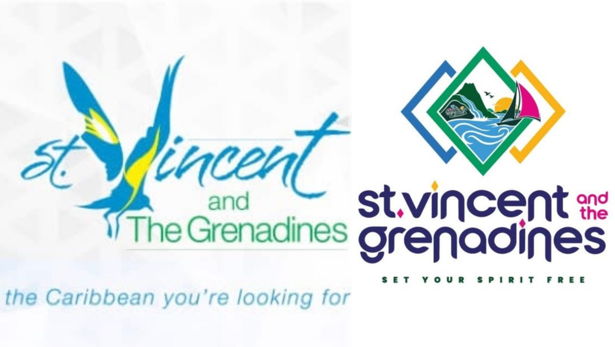
The SVGTA launched the identity at the Independence Rally on Tuesday, October 27, along with a new tagline, “SET YOUR SPIRIT FREE”. The Authority later updated its Facebook profile picture to show the new logo.
Within hours, the design became a talking point online.


Much of the criticism has been blunt. One Facebook user asked whether the country had paid for the logo or whether it was a finalist in a preschool drawing competition, and urged the Authority to “FIX IT please”. Others said the rebrand was unnecessary. One woman said she wanted the old logo back. Another said a rebrand should only happen if the result is better than what came before.
Several people questioned the spending behind the project. One commenter claimed the logo looked as if it had been produced with ChatGPT and said it had no cultural significance. No evidence has been presented to support the claim. The SVGTA says the identity was developed by an agency with input from Vincentian stakeholders.
Another point that drew support online concerned the colours. One comment noting that the colours “aren’t even in the right order” received more likes than most others in the thread. The national flag runs blue, gold and green. In the logo, the outer diamond outlines appear as blue, green and gold from left to right.


Not everyone has been critical. Radio Grenadines welcomed the design and said the people of the Grenadines had long called for a greater share of the national pie. The station said seeing the Grenadines prominently featured in the logo was a significant step towards greater recognition for the islands. In the wordmark, “grenadines” sits on its own line in the same large lettering as “st. vincent”.
What the SVGTA says the logo means
According to the SVGTA, the identity is built on three pillars: Nature and Adventure, Culture and Celebration, and Marine Paradise.
The mountain in the logo echoes the volcanic profile of La Soufrière and sits beside a waterfall and birds in flight. A glyph inspired by the carved stone at Layou Petroglyph Park honours the Indigenous peoples who first lived on the islands, and its smiling expression is meant to reflect the warmth and humour of Vincentians. The sea, sailboat, island silhouettes and sun represent the maritime character of a country of 32 islands and cays.

The three diamond-shaped outlines draw on the diamonds of the national flag. The SVGTA says they also echo homes raised on posts across Vincentian hillsides. The custom font uses exaggerated arches on the letter “n”, a nod to Kingstown’s reputation as the City of Arches.
The Authority says the identity was shaped through a collaborative process that combined agency expertise with feedback from a focus group of Vincentian stakeholders. The release did not name the agency or state the cost of the project.
SVGTA Chief Executive Officer Shafia London described the launch as a proud moment for the country.
“Our new tourism identity carries so much of who we are, the strength of our landscapes, the depth of our heritage and the sea that connects our islands,” she said.
London added that the Authority wants Vincentians at home and abroad “to recognise their home in this identity and feel proud to share it”.
Whether the public warms to the new look remains to be seen. For now, the conversation online shows that Vincentians feel strongly about how their country is presented to the world.
END


Related News
A nation downgraded, a Bank in the red: Is SVG’s debt risk coming home to roost?
Close to 100 traditional cultivators support plan to join medicinal cannabis industry
GHS student Pemberton crowned 2026 Lions/FLOW public speaking champion